While at Altered State, a New York creative agency specializing in luxury real estate and hospitality, I led creative work for the Durst Organization across multiple developments including Halletts Point, One World Trade Center, and Well&. I worked across art direction and design for brand, marketing, and leasing initiatives, developing visual systems, campaign concepts, and digital and print collateral that supported each property's positioning and market launch. My role spanned concept development through final execution, helping translate each development’s architectural and lifestyle vision into cohesive marketing and brand storytelling.
Services:
Brand Identity
Creative Direction
Art Direction
Campaign Development
Print & Digital Advertising
Signage Design
Campaign:
ONE WORLD TRADE CENTER — PENTHOUSE I & II
Delivered a cohesive campaign system that positioned the penthouses within the luxury residential market and supported sustained visibility across print and digital media placements.
metrics / impact:
Execution:
Introduce the top two penthouse residences at One World Trade Center through a campaign that reflects the scale, prestige, and atmosphere of the building’s highest floors while driving visibility among luxury buyers and brokers.
objective / challenge:
Led art direction from concept through final execution, shaping the visual world of the campaign across casting, styling, body language, and overall tone. Directed CGI production and final retouching, and designed both print and digital advertising including a four-week ROS media placement and a feature in Commercial Observer.
.jpg)
.jpg)
.jpg)
.jpg)
.jpg)
.jpg)
Project
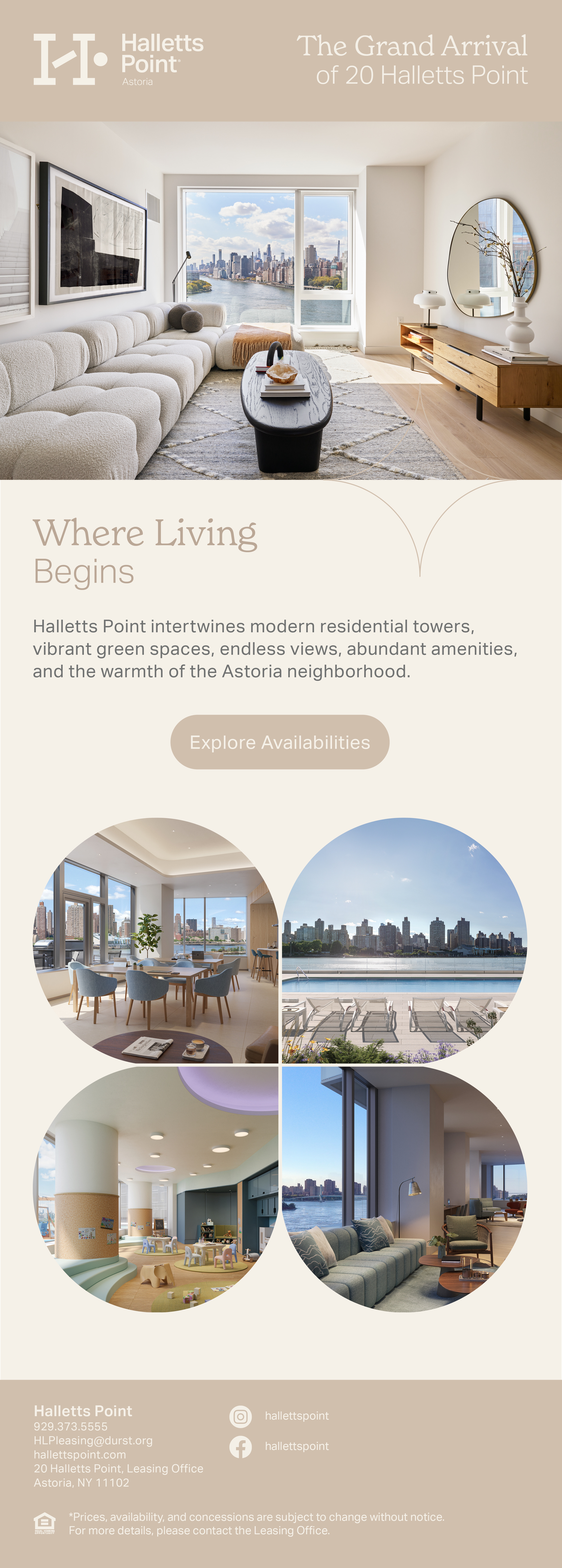
Halletts Point
metrics / impact:
Execution:
Evolve the Halletts Point brand for Phase II while maintaining continuity with the existing development, creating a visual system that reflects the warmth, connection, and everyday ease central to the community’s positioning.
objective / challenge:
Led brand identity development from concept through rollout, shaping a visual system inspired by the Danish concept of Hygge. Developed typography, color, messaging, and layout principles that emphasized softness, warmth, and human connection. Applied the identity across environmental graphics, wayfinding, signage, window vinyls, and print collateral to create a cohesive experience throughout the property.
Established a flexible brand system that maintained continuity with Phase I while supporting the continued growth of the development, ensuring consistent application across marketing, environmental, and leasing touchpoints.


Project
Well&
metrics / impact:
Execution:
Support the promotion of Well& by Durst, a hospitality-driven amenity concept spanning multiple office buildings in Midtown and Lower Manhattan, through advertising designed to increase awareness among brokers, tenants, and event planners.
objective / challenge:
Designed a four-week ROS digital advertising placement and created the front and back covers for Commercial Observer, developing layouts that highlighted Well&’s hospitality-focused spaces for meetings, events, and tenant experiences while maintaining alignment with the Durst brand.
Delivered advertising assets that expanded campaign visibility across both digital and print media, reinforcing Well&’s positioning as a premium amenity offering within Durst’s commercial portfolio.