[ Close ]

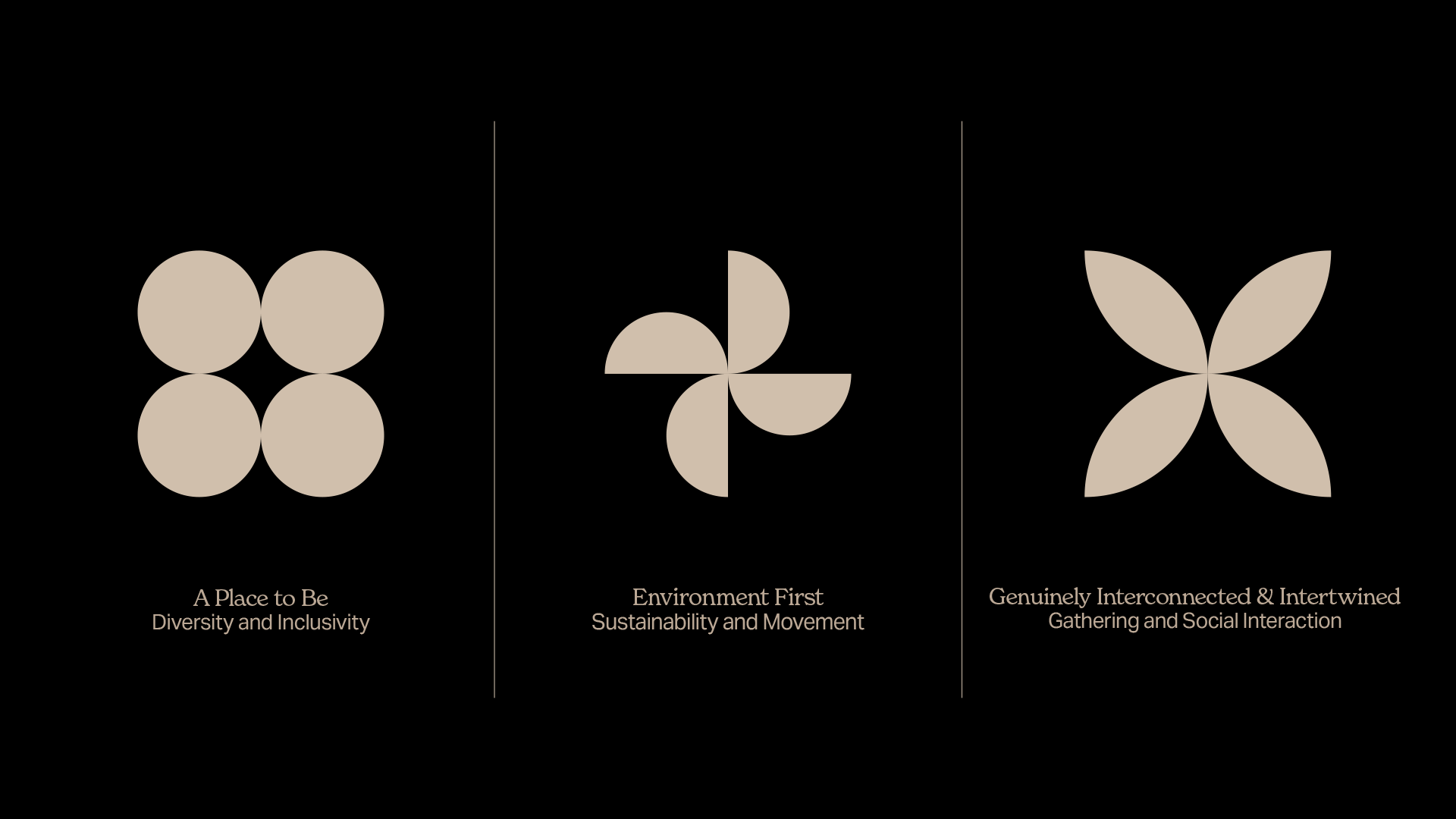
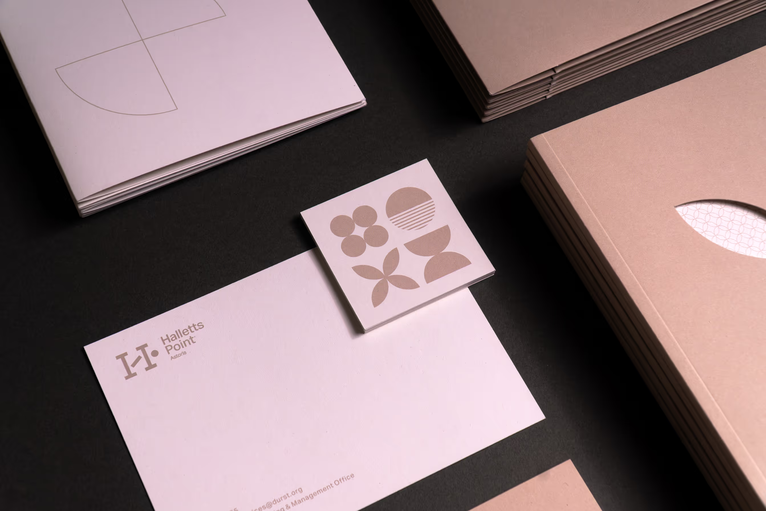
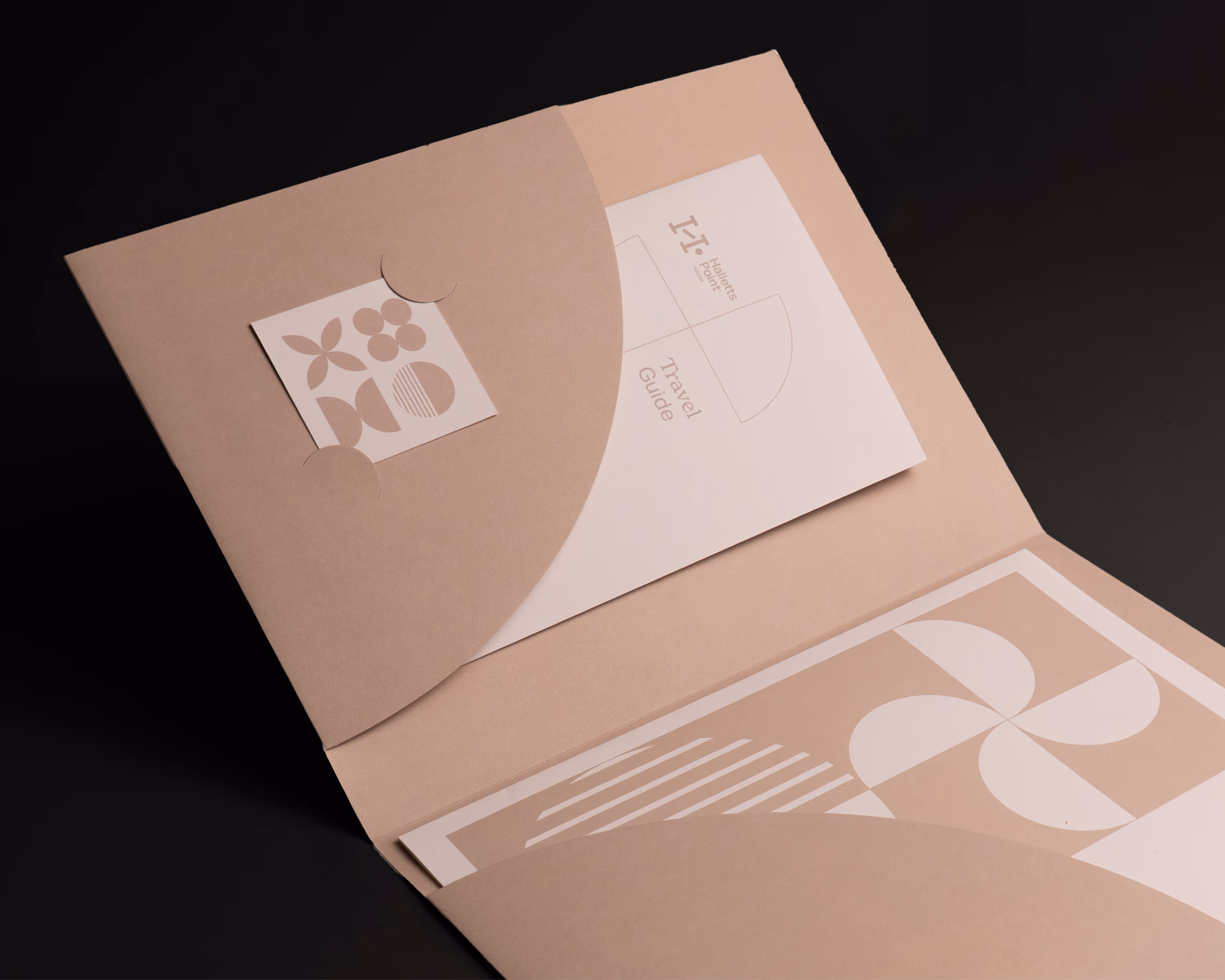
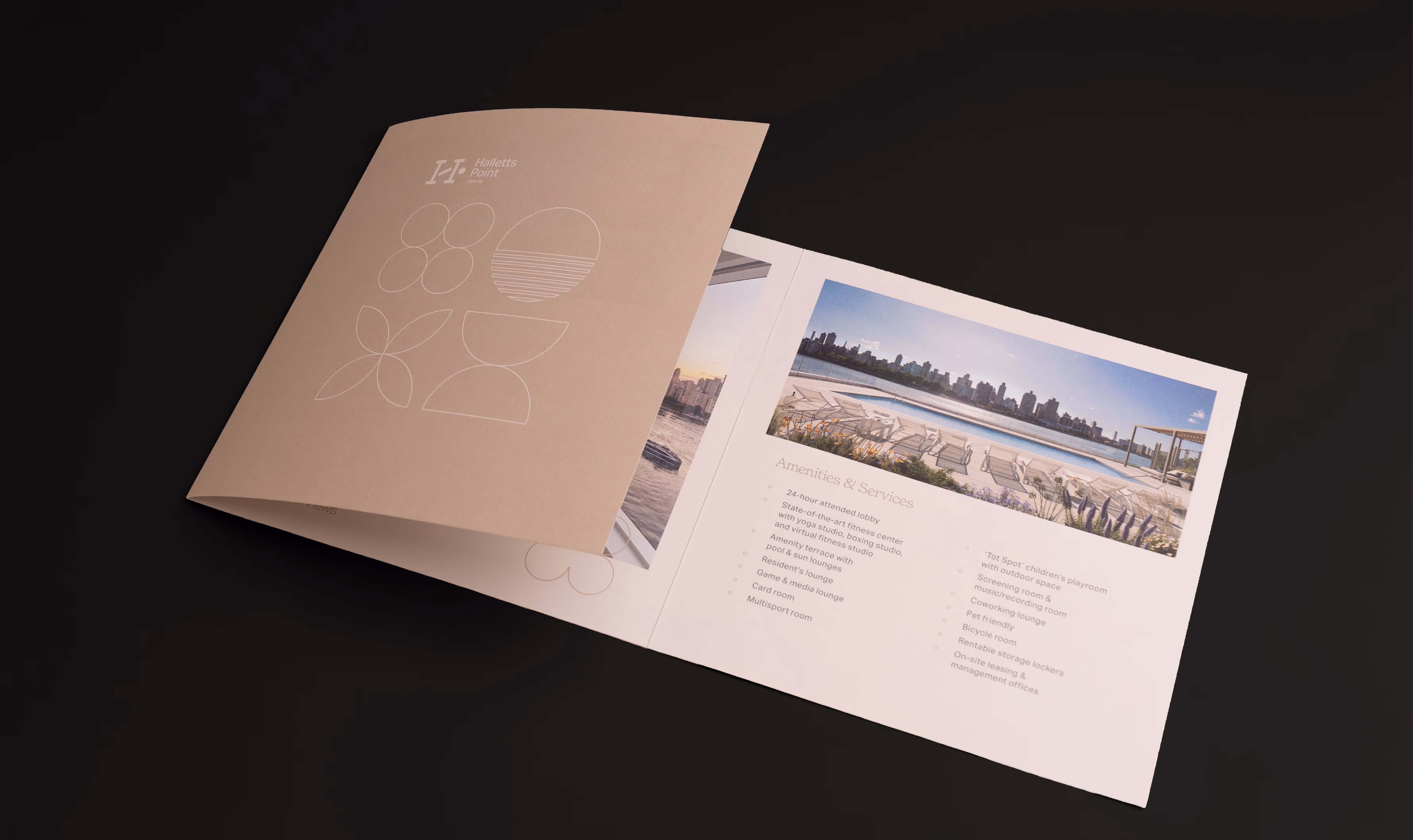
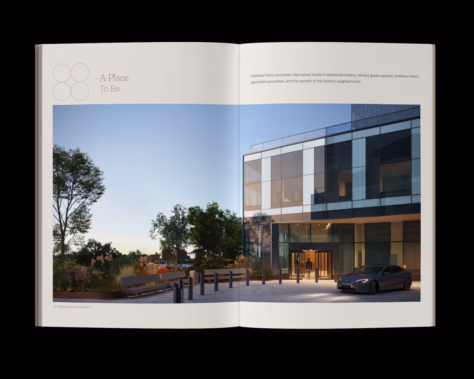
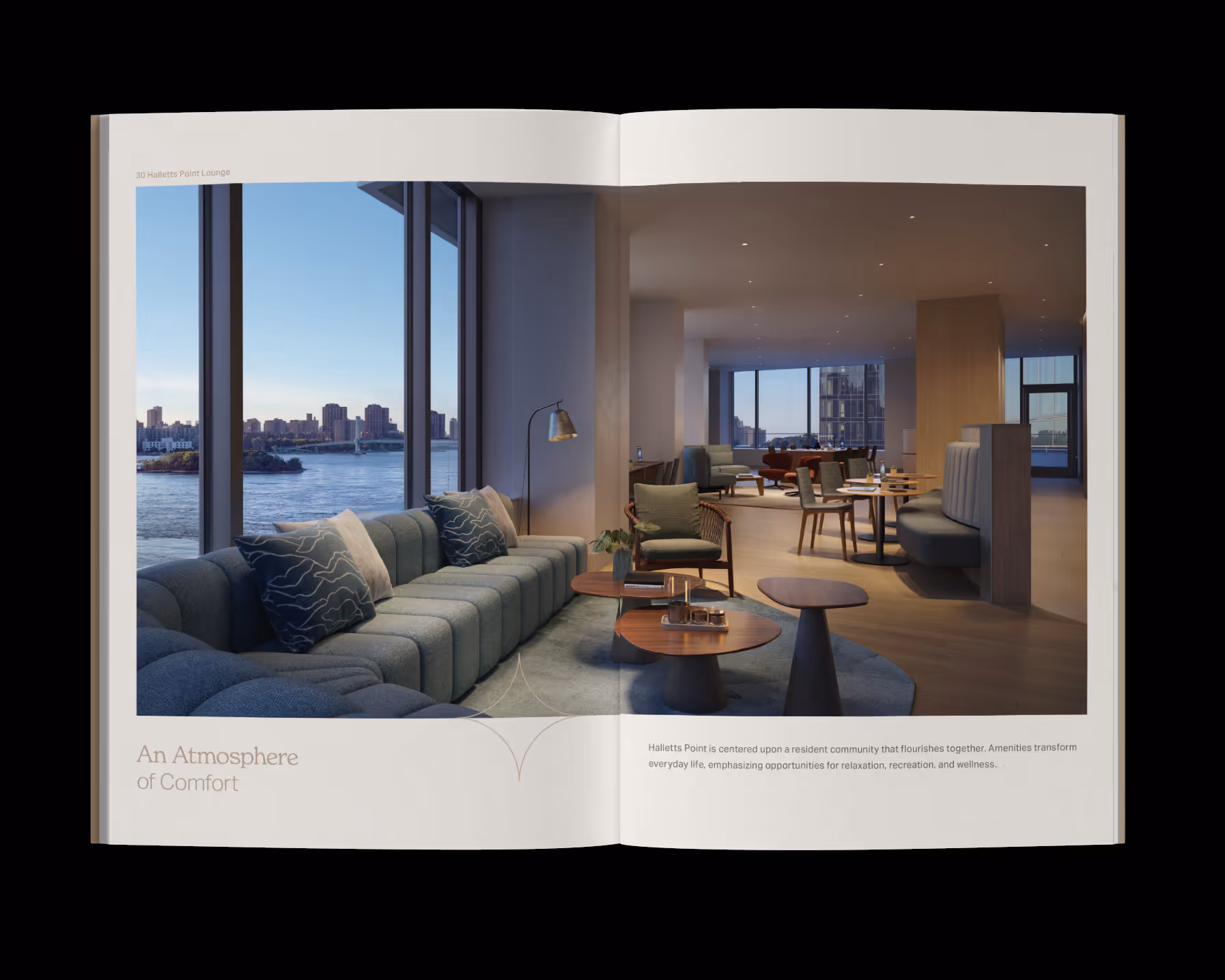
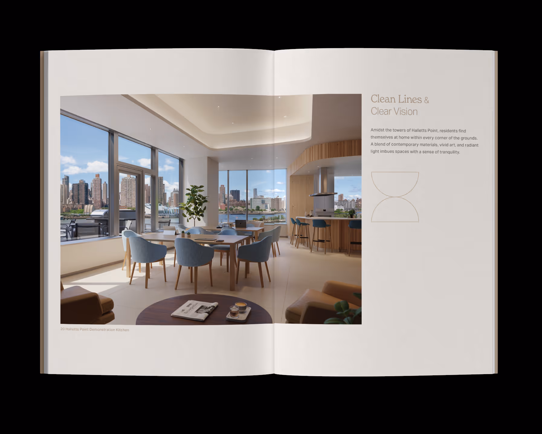
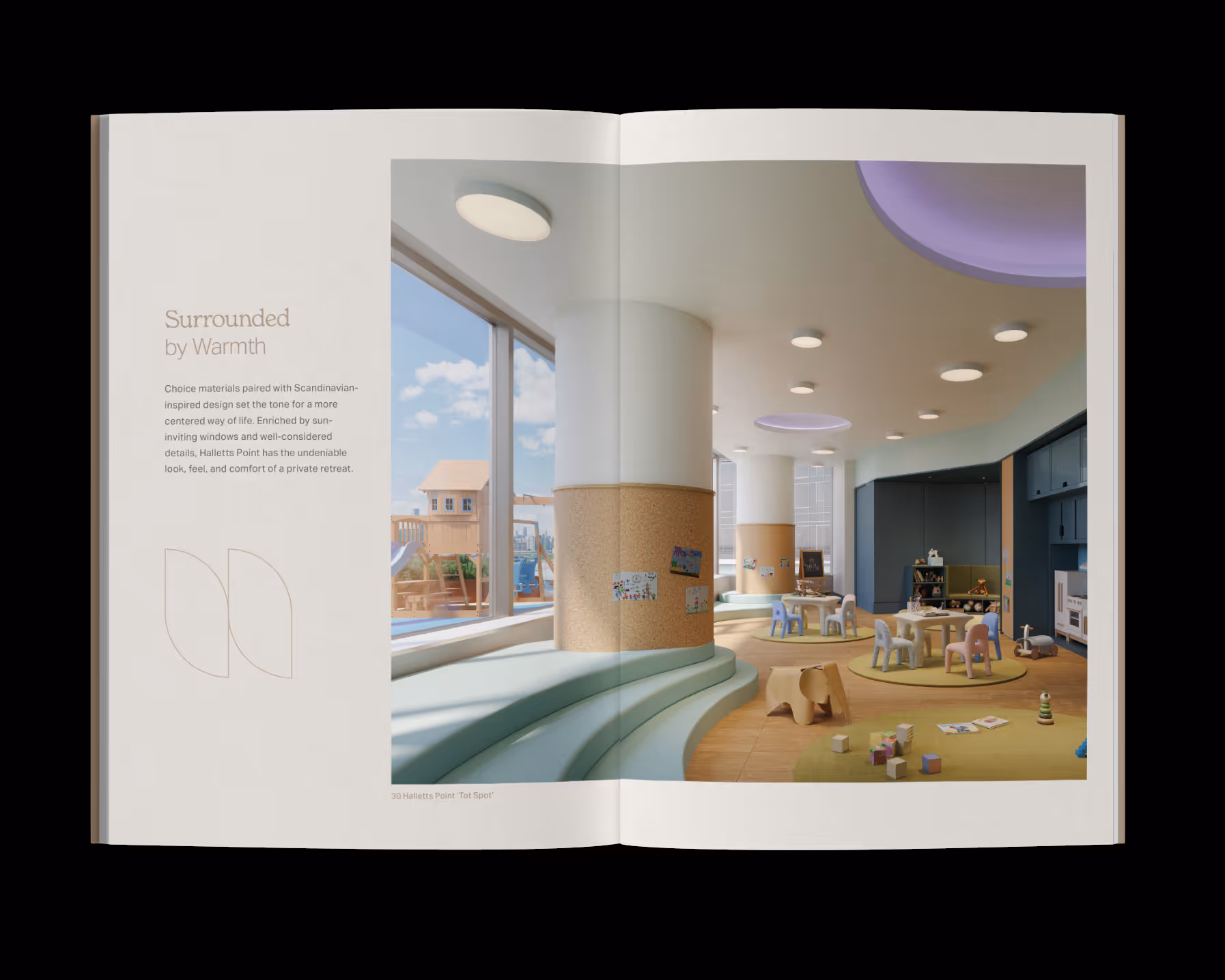
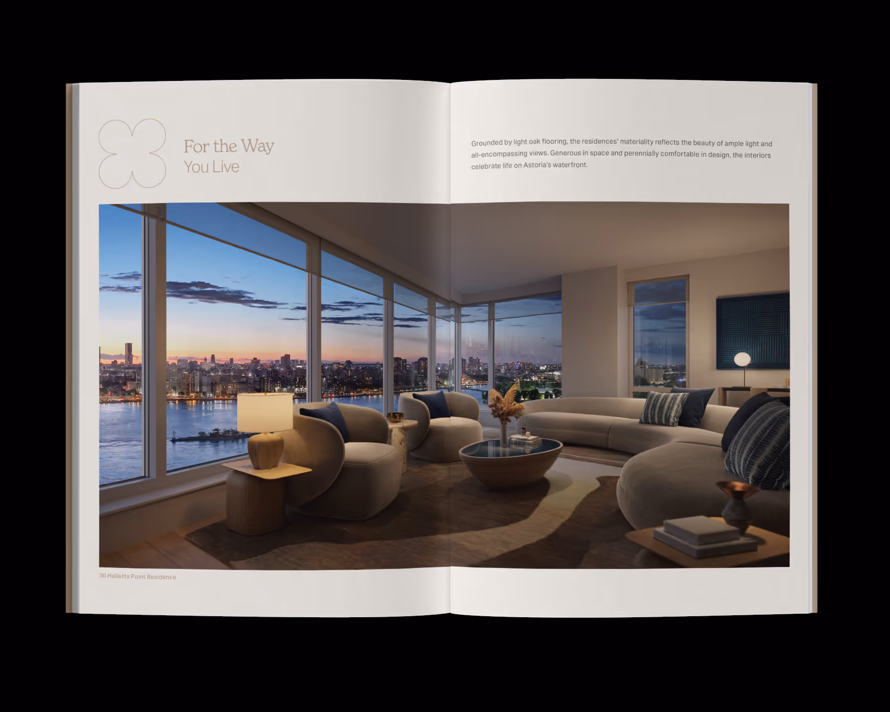
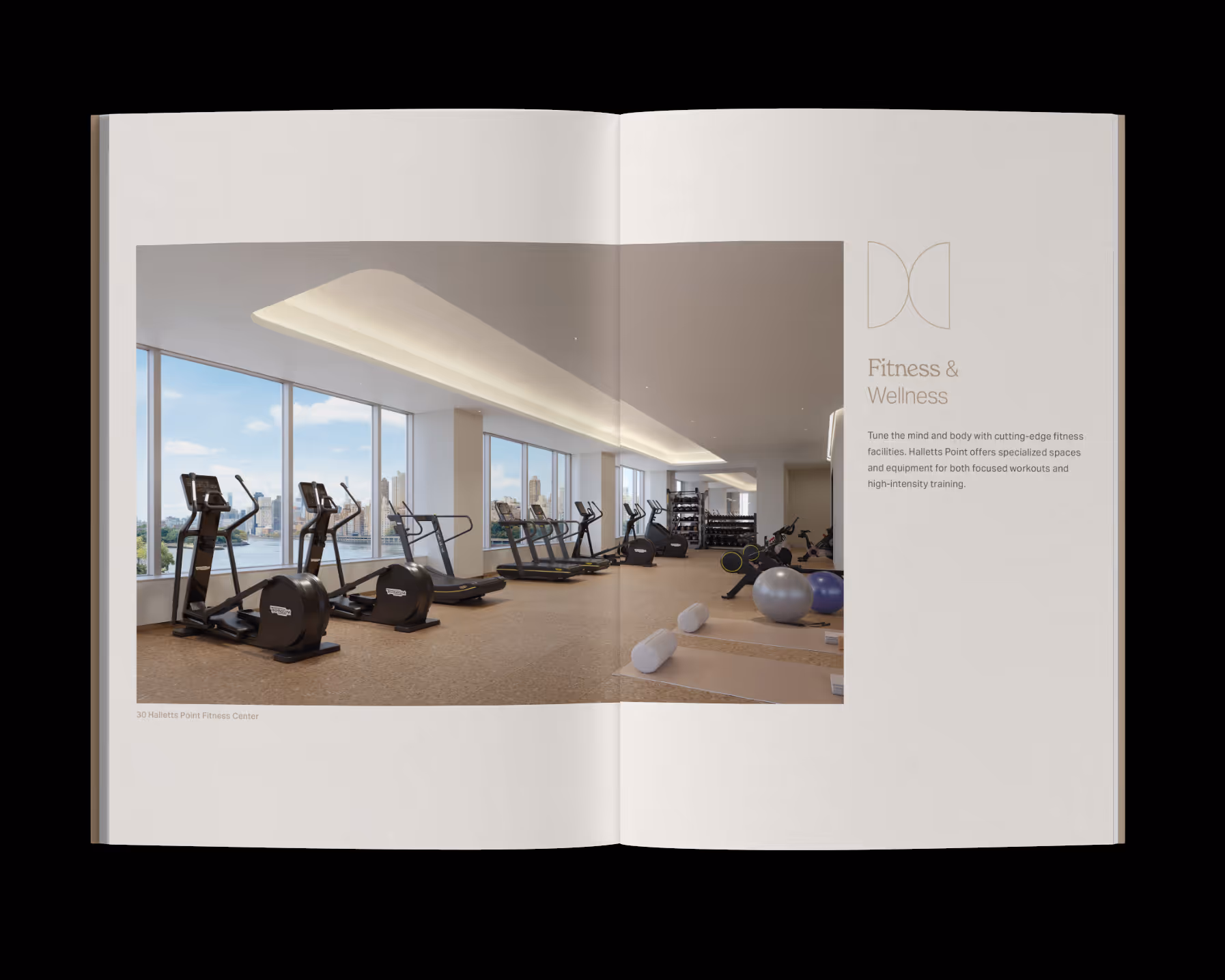
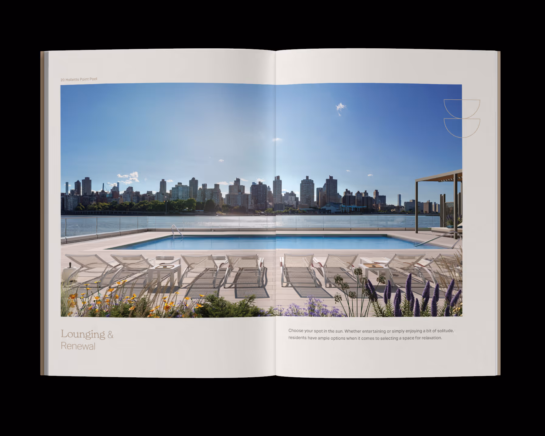
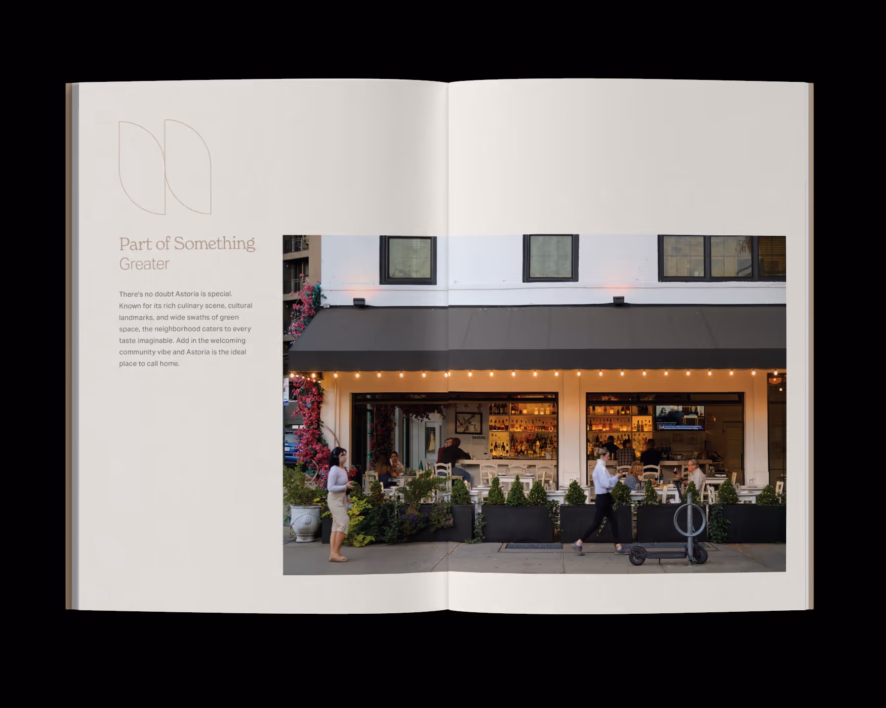
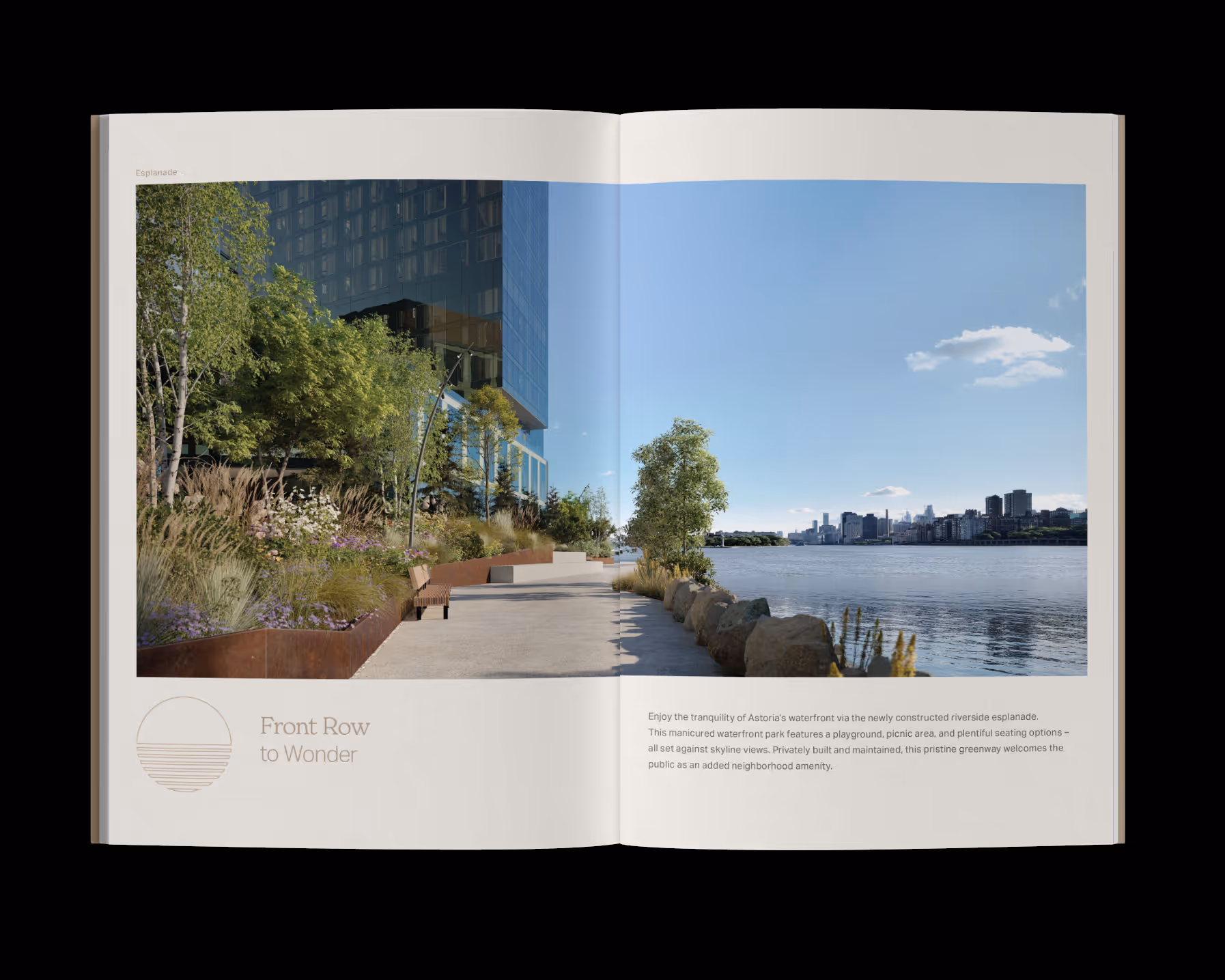
Inspired by the Danish concept of Hygge, Halletts Point is a residential community in Astoria built around warmth, connection, and everyday ease. For Phase II, I led the branding from concept through rollout—shaping a visual identity that feels grounded, soft, and human. Through intentional typography, color, voice, and layout, each touchpoint was designed to create a sense of home. From signage to print collateral, the brand invites residents to slow down and feel a true sense of belonging.

Services

Brand Identity Design
Environmental & Wayfinding Design
Art Direction

Signage & Window Vinyls
Print Collateral

Halletts Point–
Read More
The identity for Halletts Point Phase II was built to feel human and lived in. Every decision, from typography to texture, was guided by the idea of home as something soft, grounding, and connected.
Each symbol tells part of the story, reflecting moments of togetherness, comfort, and ease that define life by the water.
The system expanded into a full identity, translating brand values into tangible expressions across print and environment.
The brochure, included in the resident welcome package, captures the warmth and ease of life at Halletts Point through understated typography and material detail.
From retail vinyls to city buses, the brand system scaled into environmental applications designed to strengthen visibility and community presence.

Join our newsletter

Resources, Deals, and New Offerings
Thank you! Your submission has been received!
Oops! Something went wrong while submitting the form. Having trouble? Email us
Studio-