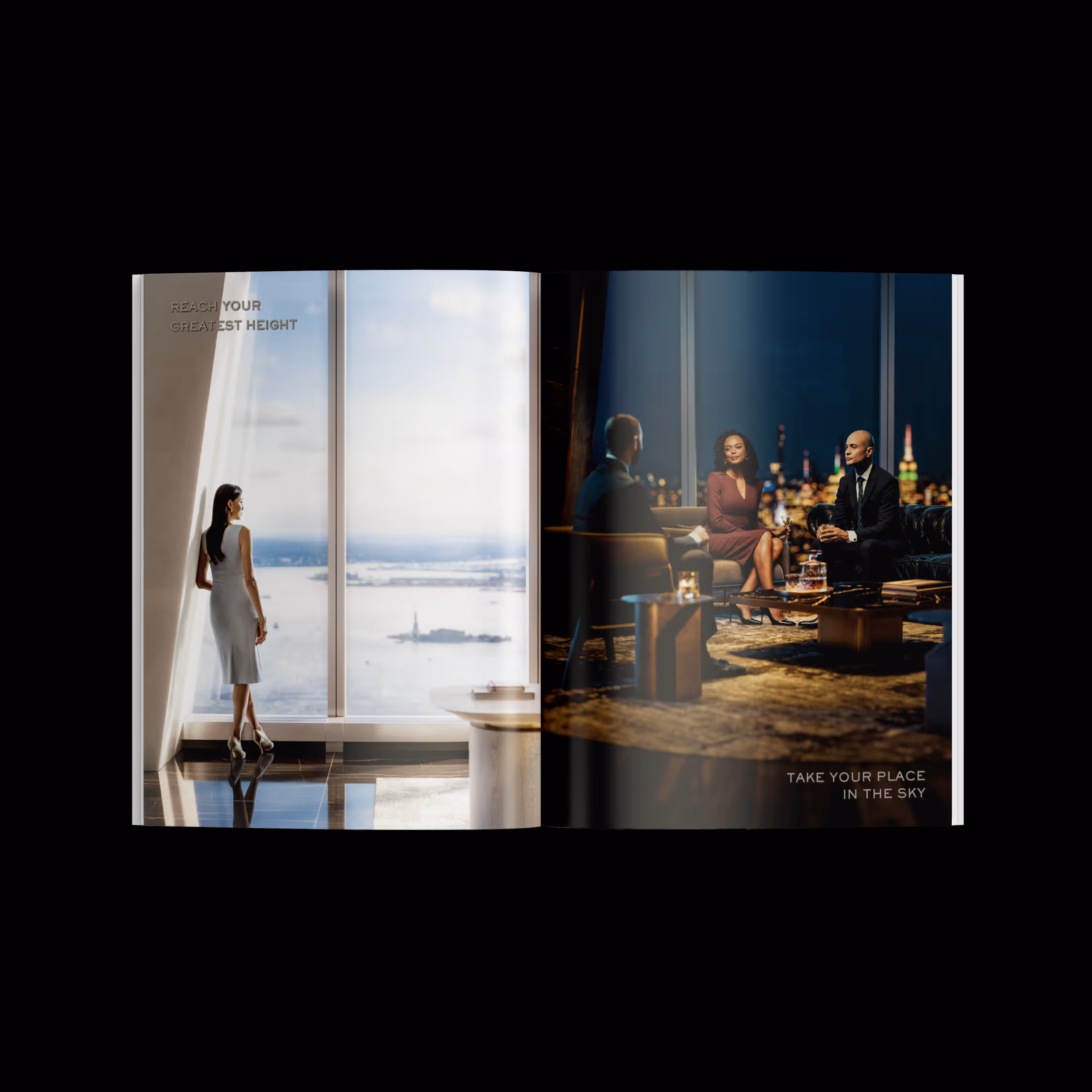
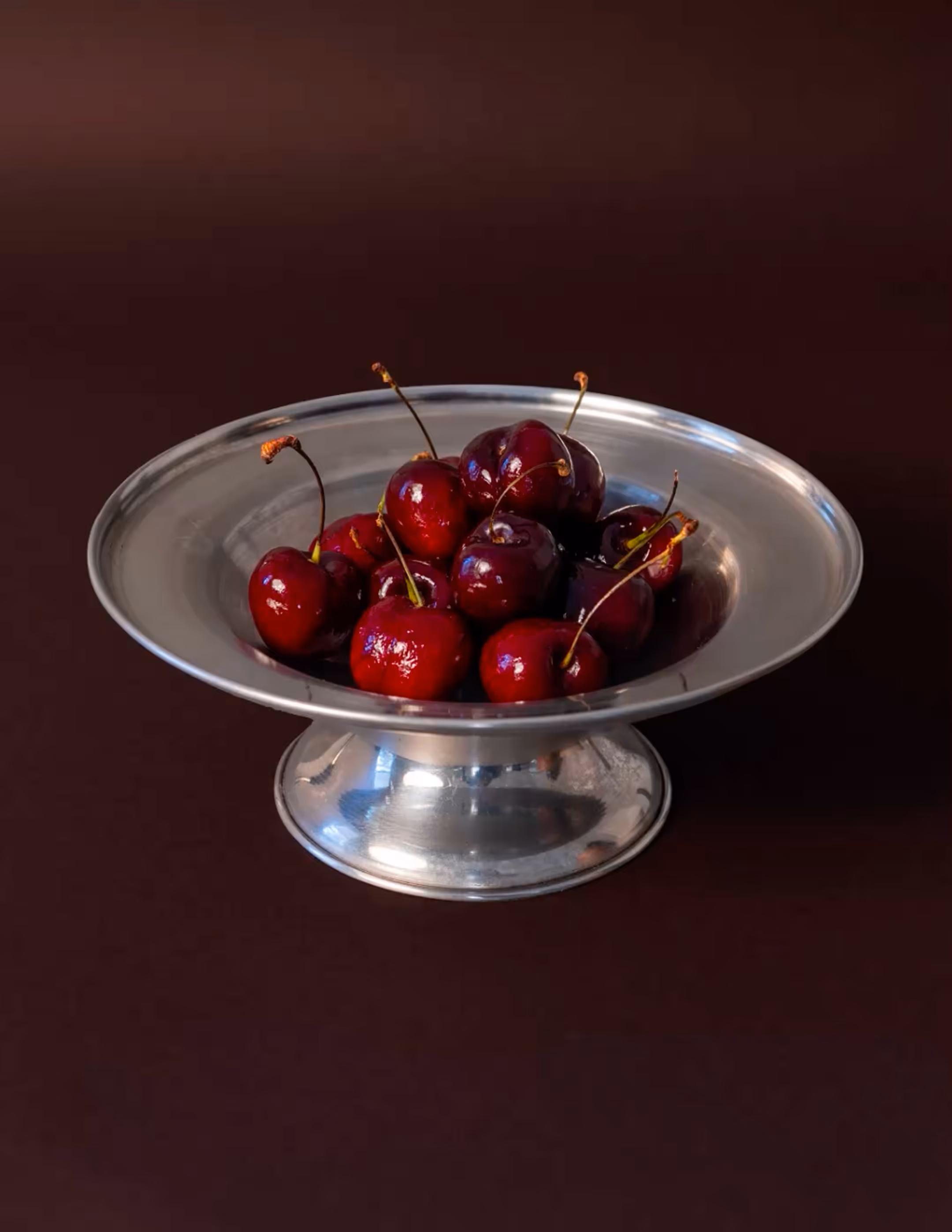
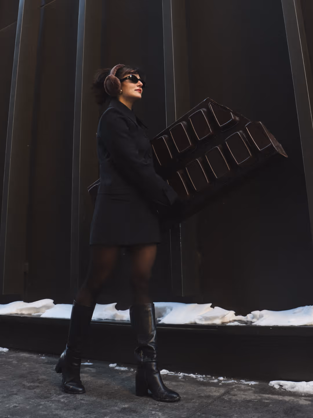
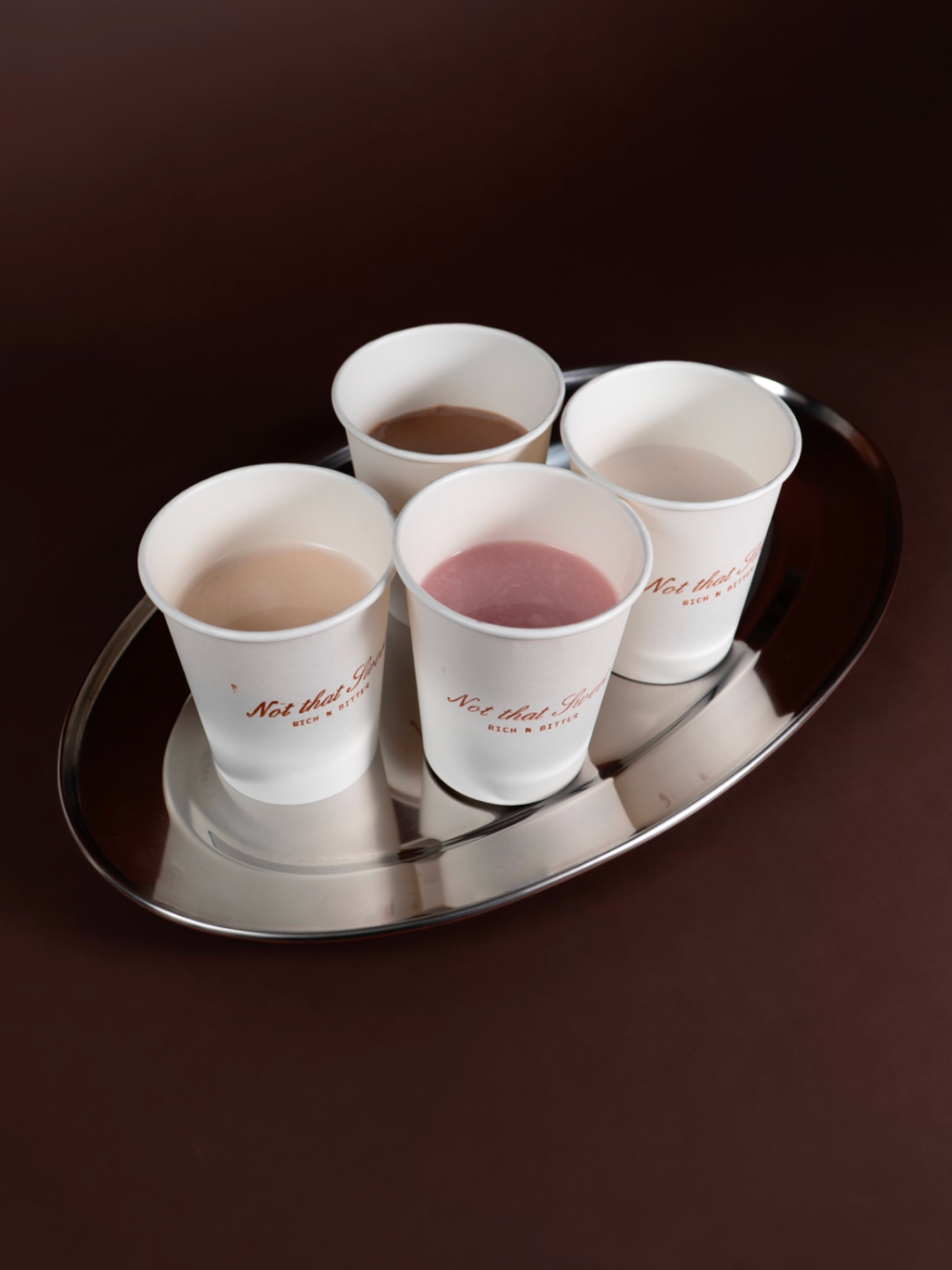
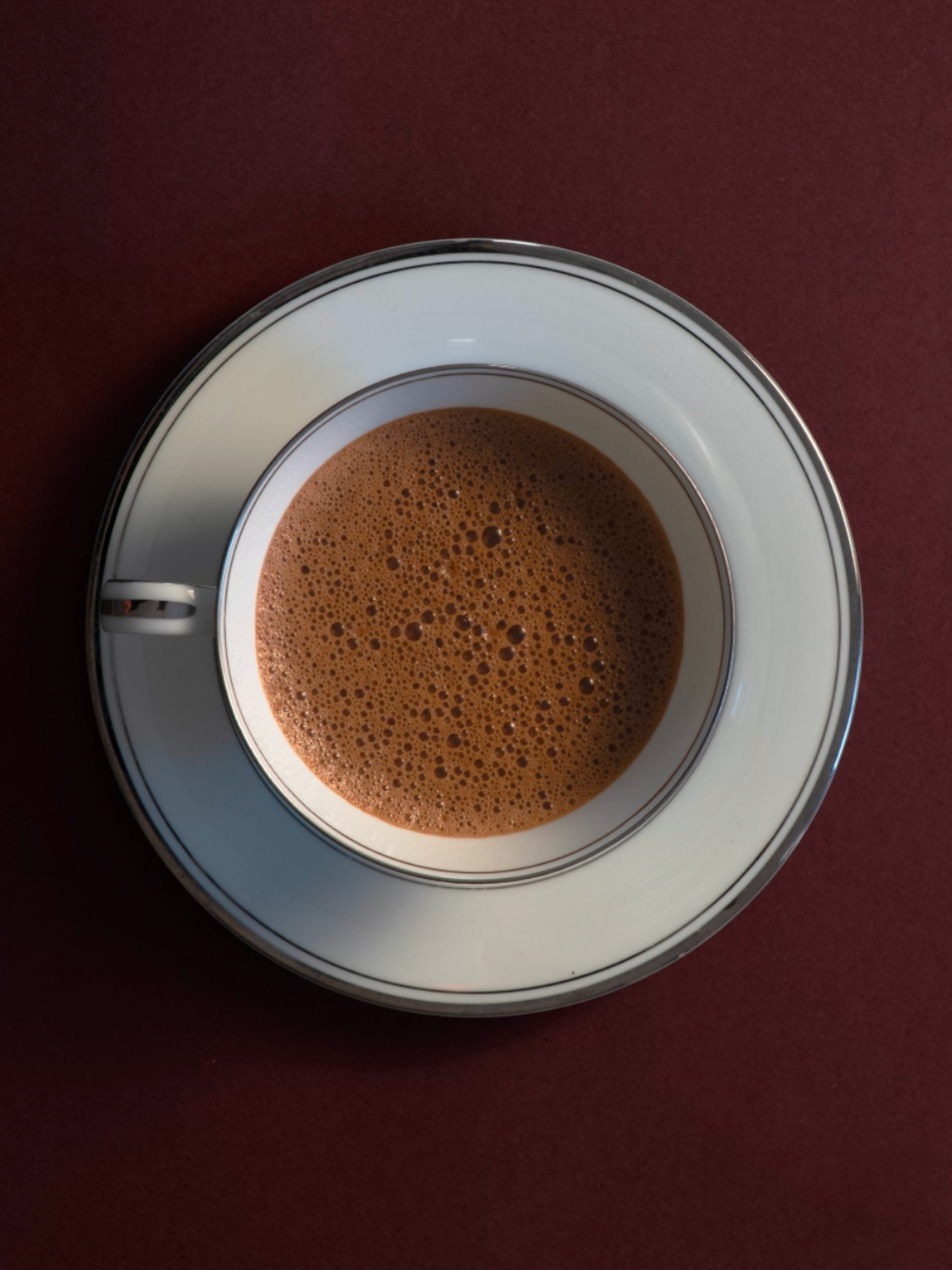
Anej Skin Studio came to me with a vision: merge their cutting-edge treatments and curated product line into one elevated digital experience. I led creative direction across brand identity, photography, video, and web—crafting a visual language that honored their existing logo while elevating the brand as a whole. The result is a streamlined, headless Webflow site with Shopify integration, designed to reflect the same care and curation they bring to their space. It’s a seamless blend of storytelling, design, and functionality—where luxury skincare meets a modern online experience. Explore the site here.
Services
Creative Direction
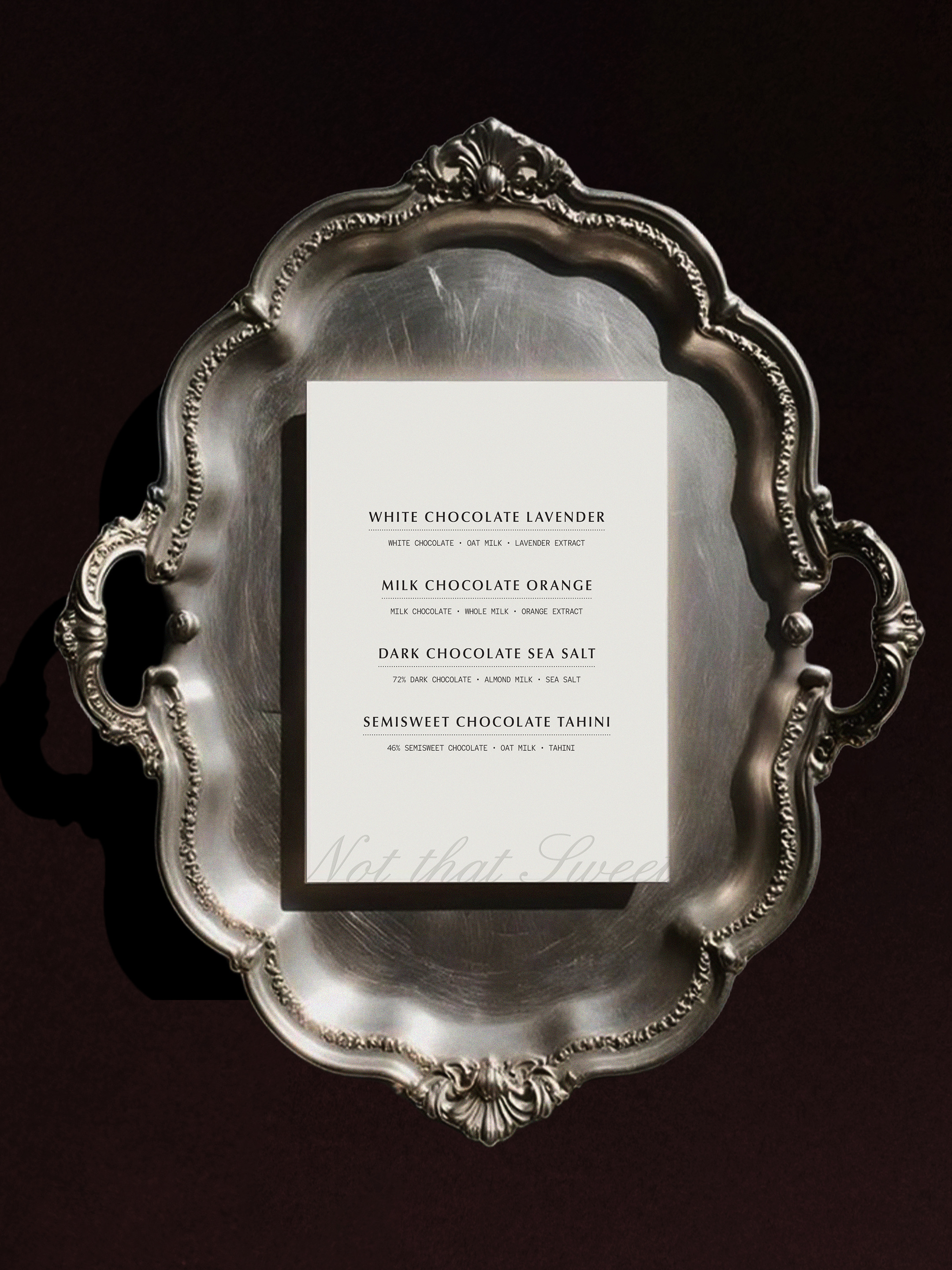
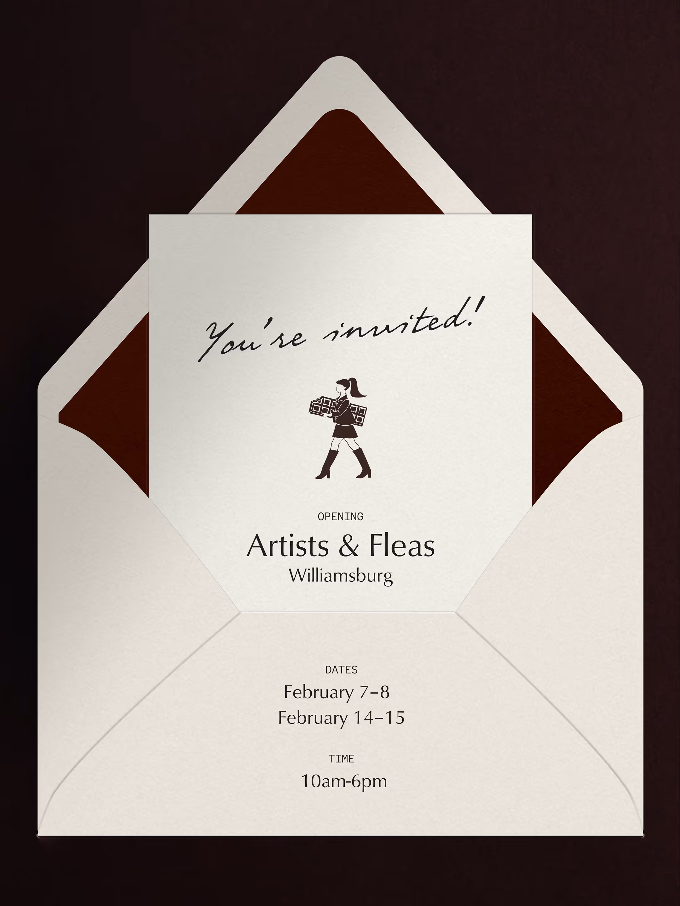
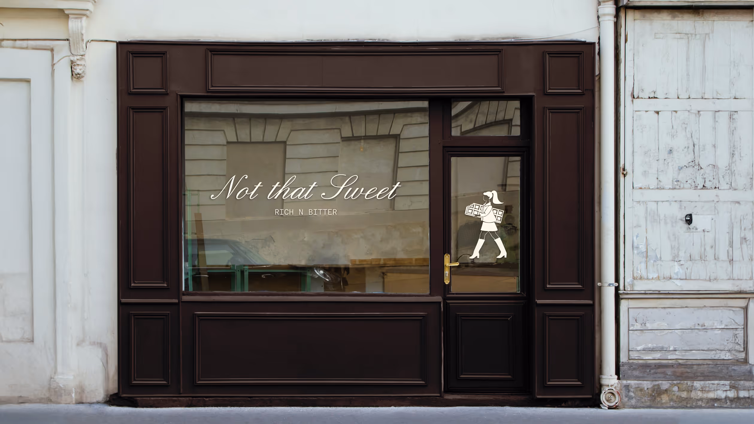
Brand Identity
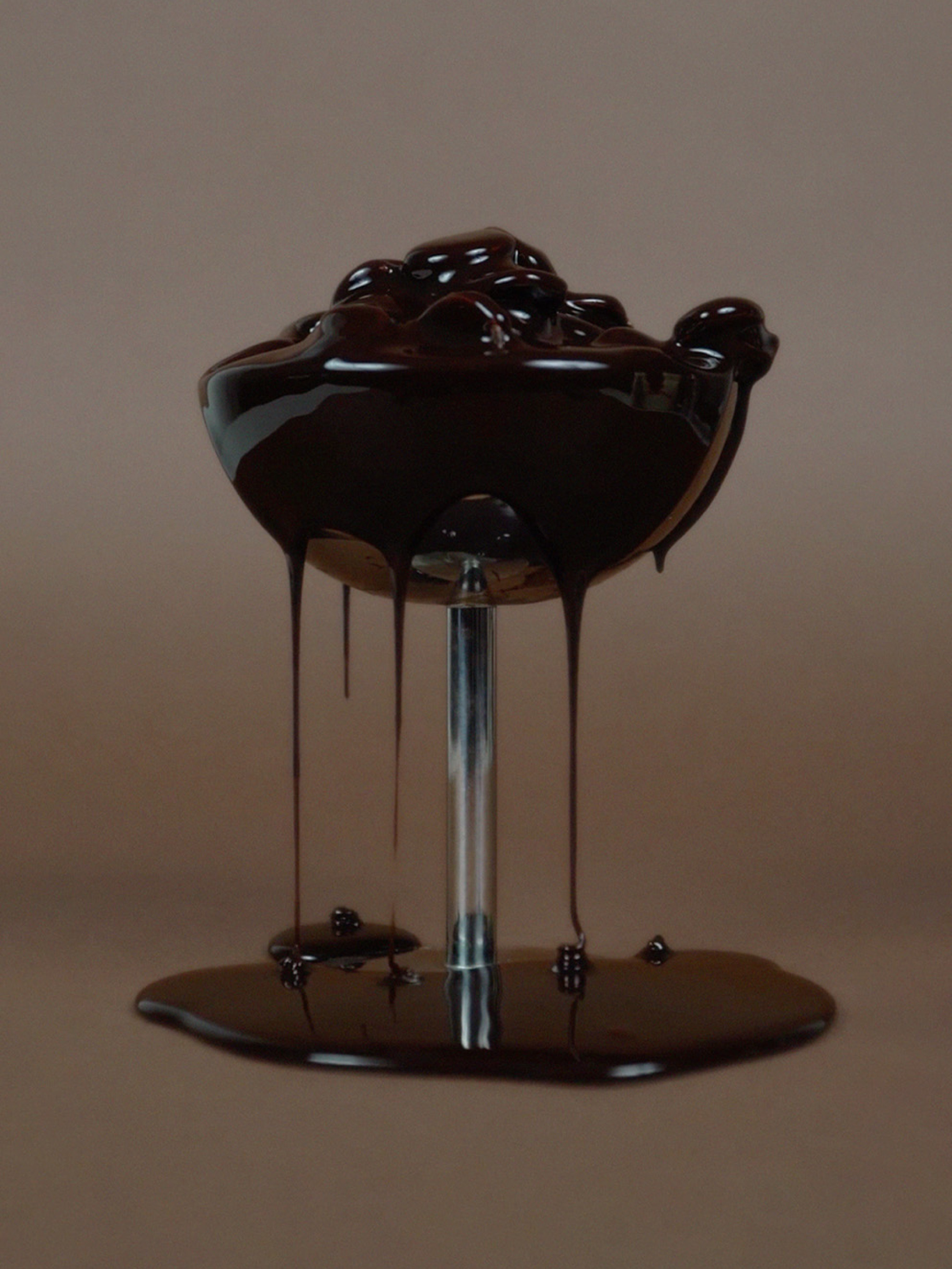
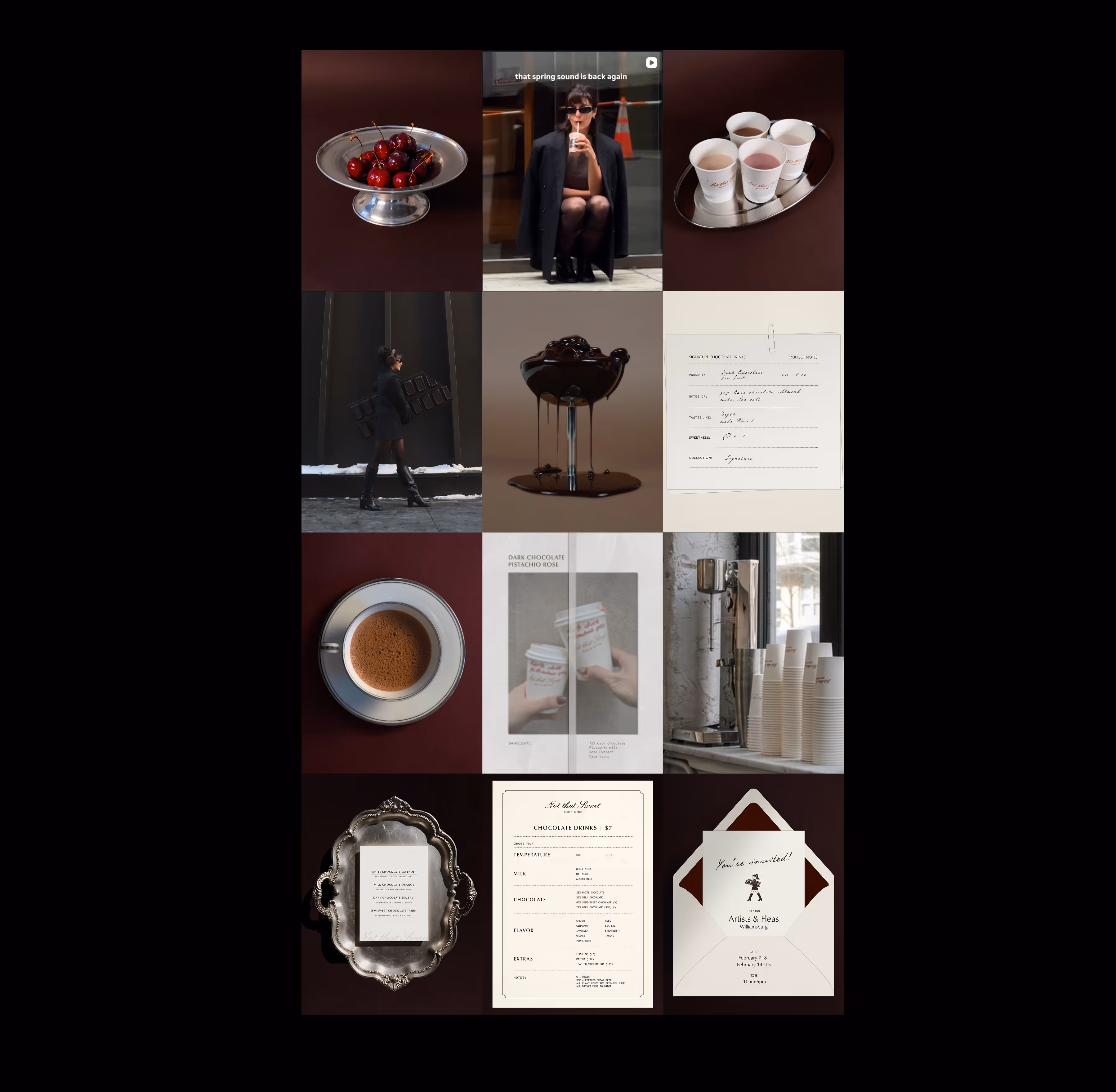
Photography & Video
Campaign Art Direction
Web Design & Dev,
Shopify Integration
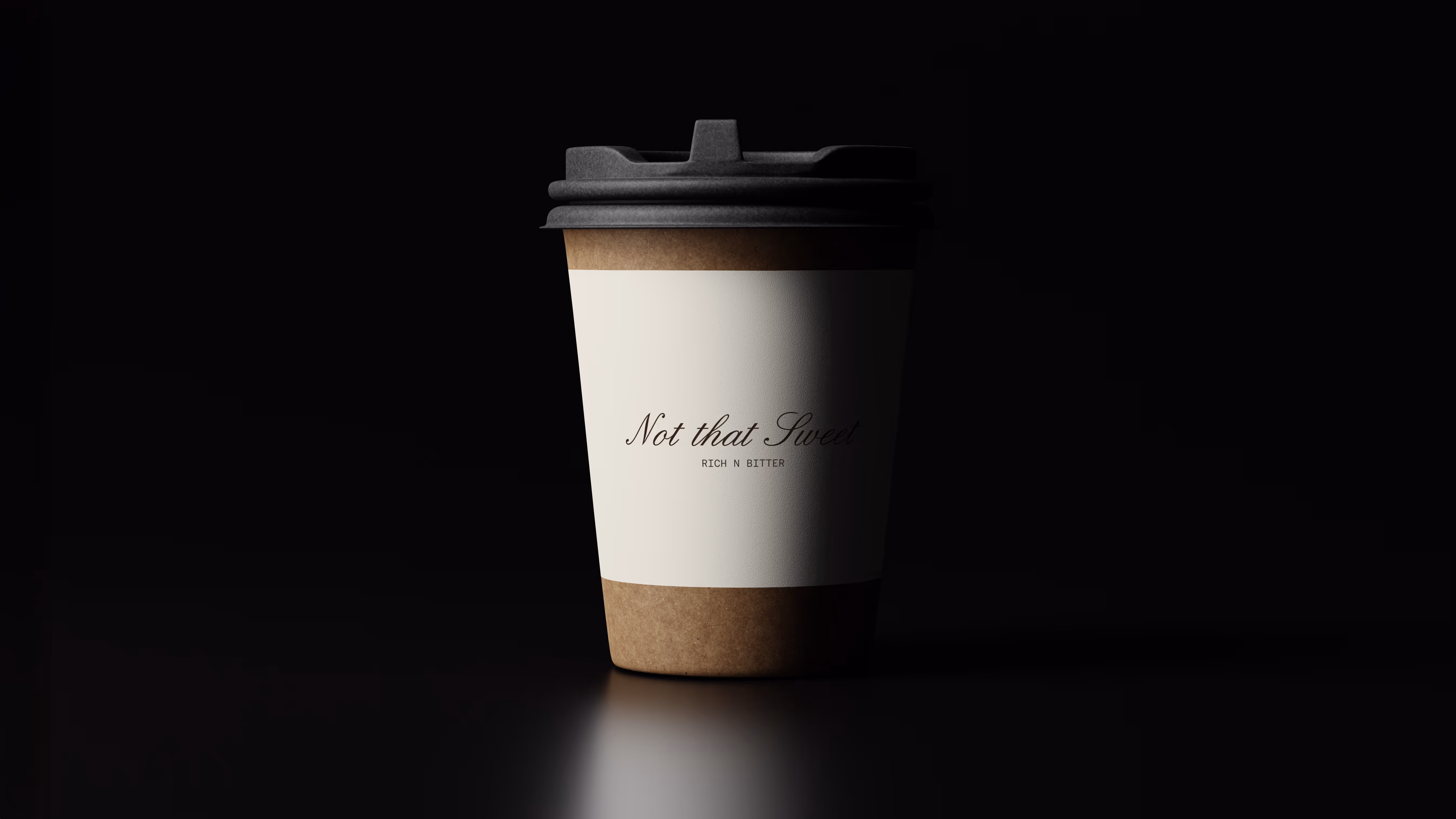
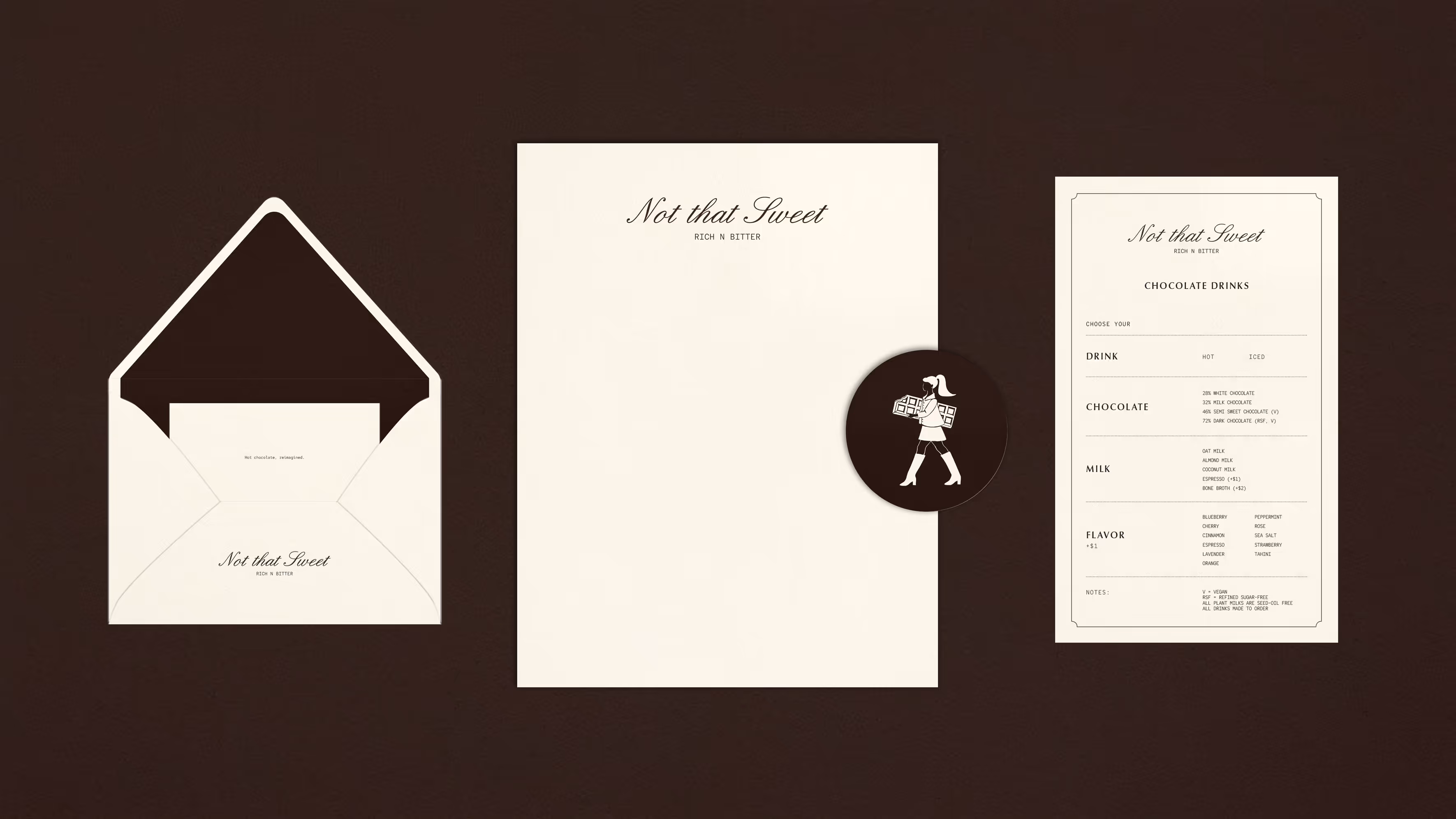
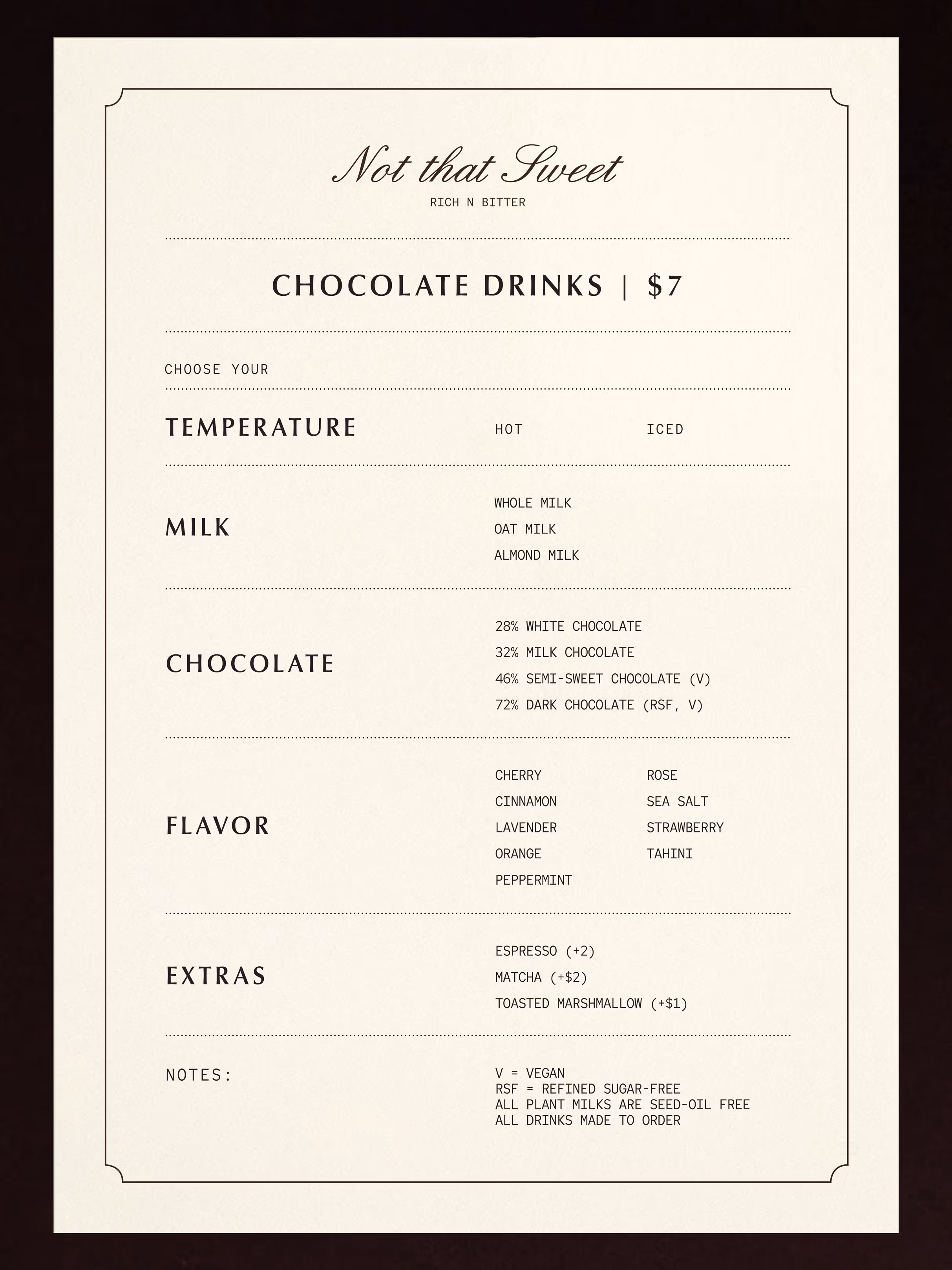
Packaging & Print Collateral


.avif)
.avif)
.avif)
.avif)
.avif)